At DECO Window Fashions, we want to help you create the most beautiful room possible and the colors you pick play a huge role. That’s why we have written up this quick explanation of color theory, something that anyone who is working on redesigning their home should consider. After all, color can bring a room together.
Color Theory
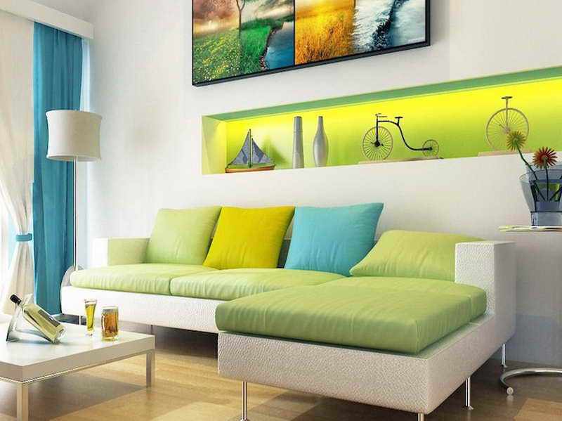
Color is an essential part of interior designing. Everyone has their own favorite color and even their favorite combinations of colors – but did you know there’s a scientific reason why some colors work well together? Color theory is the reason why some colors clash and others work well together.
This theory has developed over thousands of years. From cave paintings to Aristotle to Leonardo Da Vinci – color systems have been developing for a long time, helping artists create masterpieces. And now you can use color theory when picking your next window treatments for your home.
Color Wheel
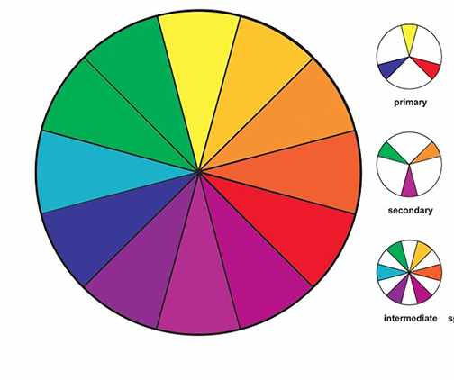
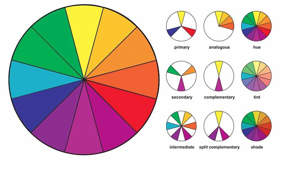
You may have heard of the color wheel before but in case you don’t remember it from all those years ago here’s an explanation. Simply, the color wheel is a visual representation of what colors blend together well. There are about 12 colors in the color wheel that can help you determine what colors work well together.
Types of Colors
Primary Colors – Red, Blue, and Yellow. These colors can’t be created by other colors.
Secondary Colors – Orange, Purple, and Green. These colors can be created by mixing the primary colors together.
Tertiary Colors – Six different shades that are made from mixing primary and secondary colors together.
Color Schemes
Color schemes are an arrangement of the above colors – picking and choosing colors to make them look pleasing together. These schemes are something you should keep in mind when coordinating and/or designing a room as color schemes can help you figure out what colors work best together.
Complementary Color Scheme
The complementary color scheme is the simplest color scheme. It uses two colors that sit opposite of each other on the color wheel – one will be a dominant shade, typically, and the other will be an accent shade. This color combination is usually drastic and has high contrast – it may not work for every room. It might work best when you want to draw attention to a certain design element or room. You may also need to add a neutral color here or there as an accent to give your eyes a break from the contrasting colors.
Split-Complementary Color Scheme
The complementary color scheme may be too bold for your room, but split complementary might work better. You start with a base shade and instead of choosing the color directly opposite of the base, you choose two shades on either side of the opposite color. This will create a balanced contrast rather than an overwhelming one. You’ll still get the visual impact of bold color, but you’ll be able to use it more often instead of relying on neutrals. Split-complementary works best when the base shade is a muted dominant color – using the other colors as bold accent shades to highlight certain parts of the room.
Analogous Color Scheme
An analogous color scheme is when three colors are used that are all in a row on the color wheel. This means that two colors will be primary colors and the one in between will be a secondary color (a result of the two primary colors being mixed together).
You will have to use the 60-30-10 Rule in order for this to work well without overwhelming a room. This means that the dominant color will occupy 60% of the room, a supporting color will occupy 30%, and the accent color should occupy 10% of the room. The accent color should also be the most vibrant and bold color.
Triadic Color Scheme
This color scheme occurs when three colors with equal space between them on the color wheel are used together in a room. Red, yellow, and blue, the three primary colors, would be a triadic color scheme. The triadic color scheme is a bold color scheme because the three colors highly contrast each other. This scheme is used most often used in children’s bedrooms or play areas because of the liveliness of the contrast and colors.
Tetradic Color Scheme
This next scheme requires using four different colors and is often called a rectangle color scheme. It focuses on using two distinct pairs of complementary colors. Two warm colors and two cool colors would work well together and both break up and bring balance to the space.
Square Color Scheme
The square color scheme is very similar to the rectangular/tetradic color scheme. It also uses four shades, but instead of focusing on opposing, complementary pairs, the colors are evenly spaced throughout the color wheel.
No matter which colors you choose, this scheme will be comprised of one primary, one secondary and two tertiary colors. Two warm and two cool colors, like the tetradic scheme, work better together than all warm or all cool. However, only one color should dominate the space and the other three should be used as accent or supporting colors.
If you choose to work with us at DECO Window Fashions, we will help you determine what color window treatments would work well in your home’s color scheme. Call us at (512) 250-8600 for a consultation or visit our store in Austin and we will help you find the best window treatment for your home.


